SoulCraft
Strengthened by the modernist movement targeting the men's fashion market, Widarto Impact developed a strategy and brand identity for a new clothing brand.
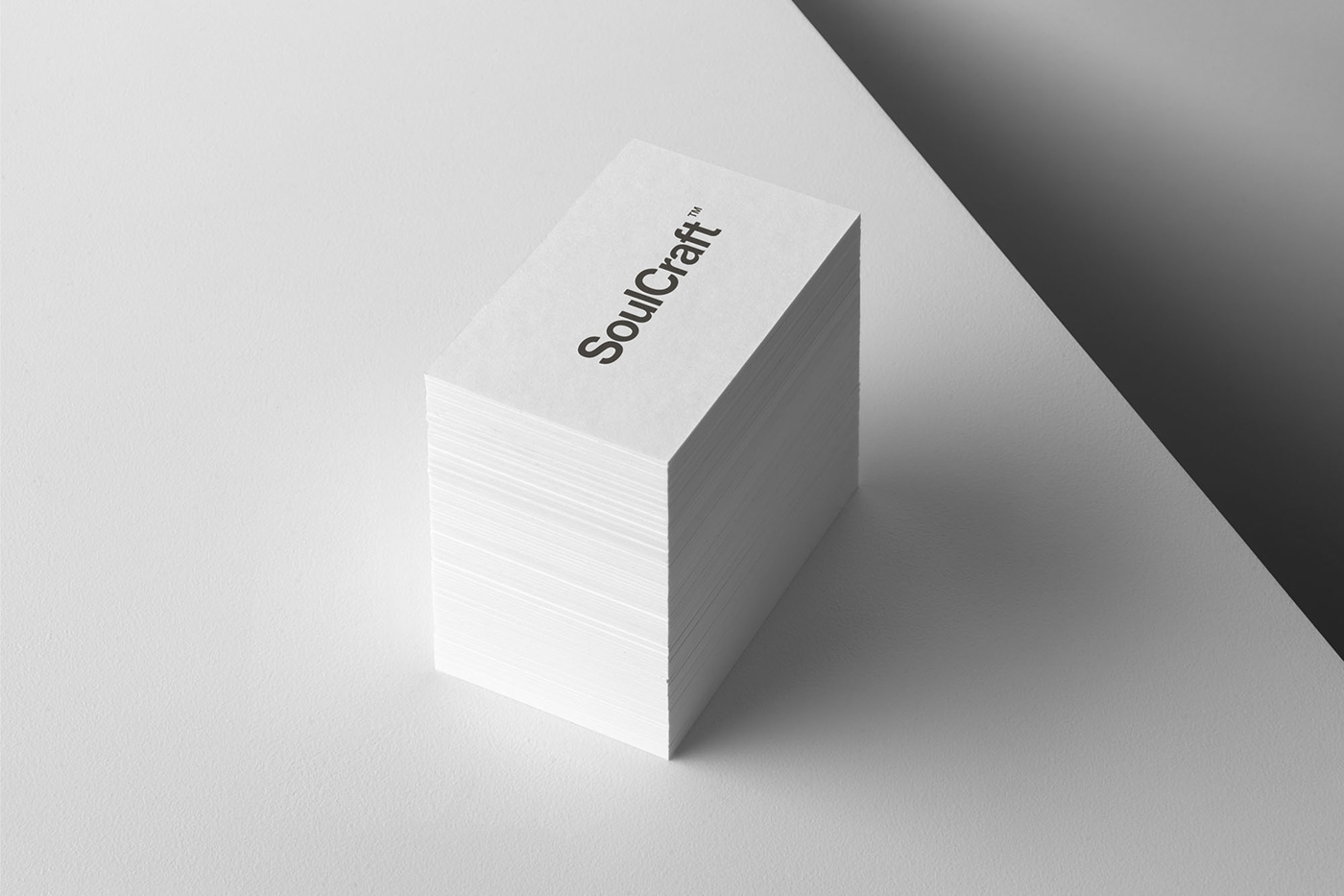
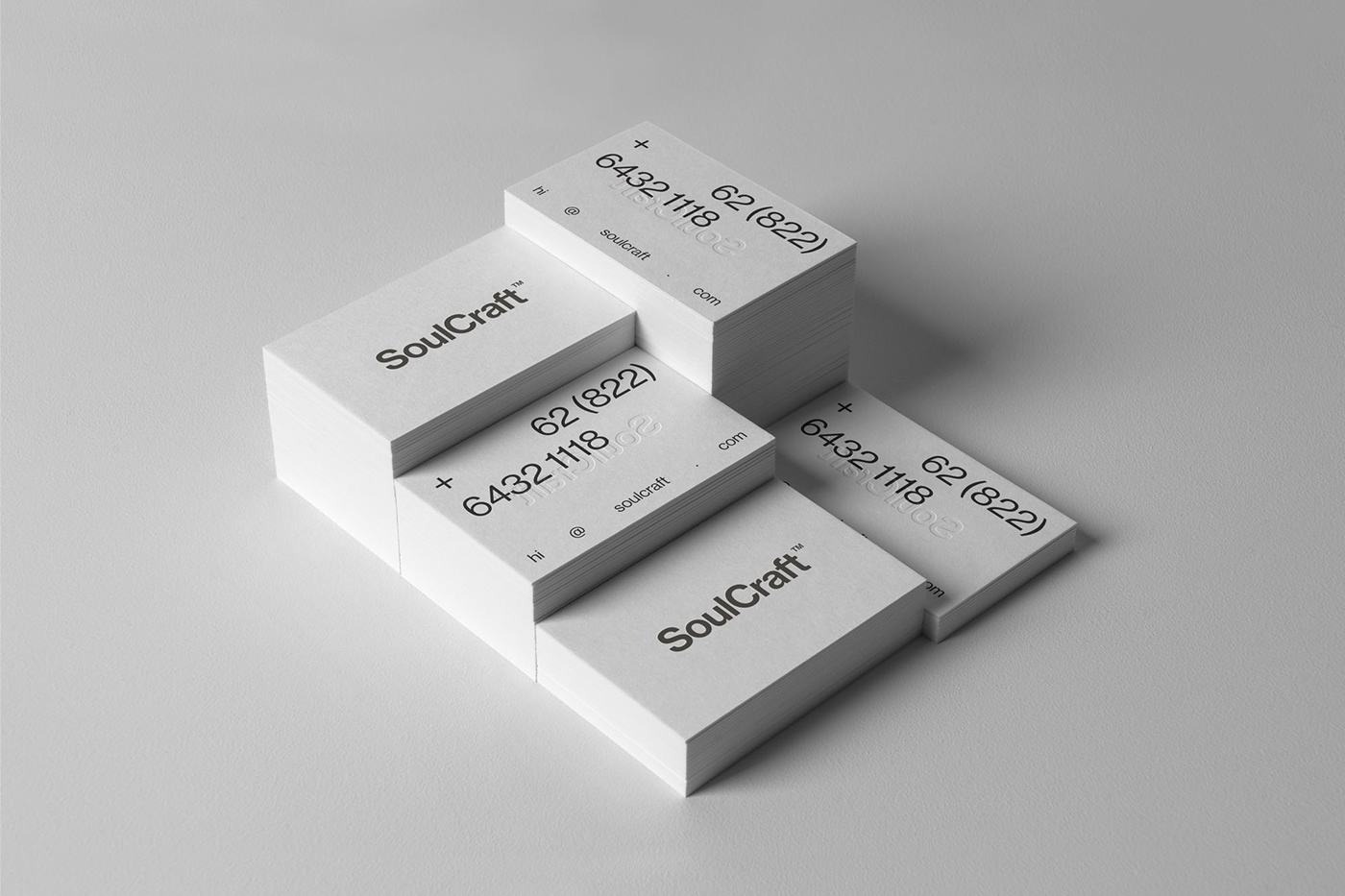
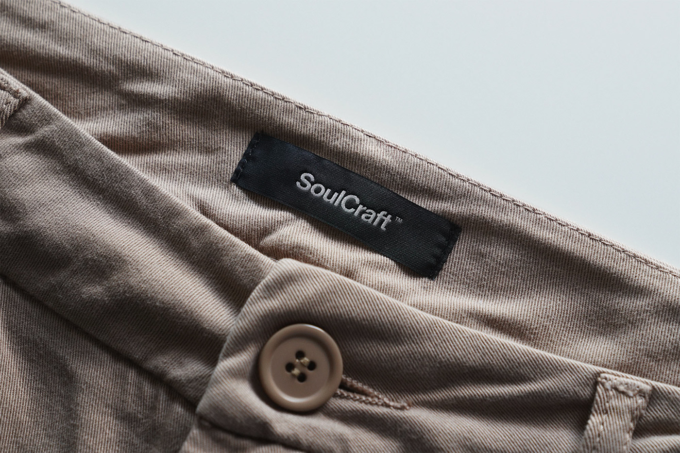
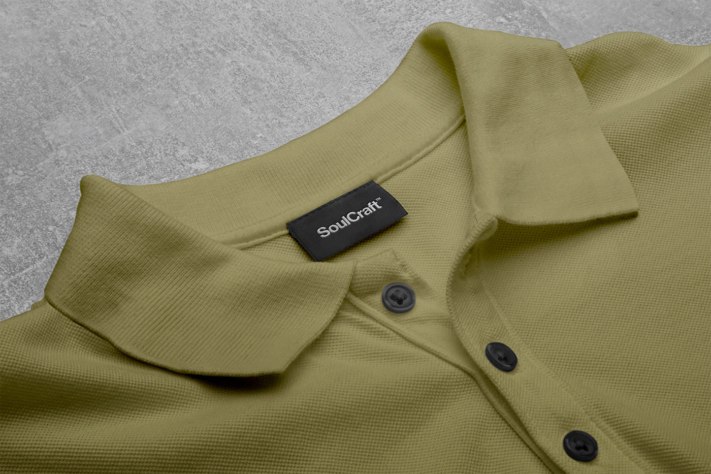
We started by naming this clothing brand SoulCraft, a name that is straightforward, clear, and symbolizes the dynamic side of men. By only designing men's clothing, understanding every curve of his needs, which must be reflected in the brand identity. The SoulCraft brand identity demonstrates the power of simplicity, through a thoughtful typography approach with a strict graphics system.
The choice of Neue Haas Grotesk as the main typography certainly gives its own reason, namely to support a brand vision that focuses on nature and sustainability, because Neue Haas Grotesk which is the next Helvetica is a timeless typography.
We customized the typeface as a Wordmark, adding a little indentation at each corner of the letter, to give it a dynamic and flexible feel.
The typography-based design approach as a brand graphic system is to support the brand's mission to present dynamic, fit and casual menswear. For the brand colors, we chose colors that can be applied any time, every season, and encourage the brand's consistency in the sustainability vision, namely white and black. Yes, kidding, the guy can be strong, sturdy, but also gentle.
All of these brand identity designs are designed to push brands in the right direction, are easily identifiable and fully support brand communication both digitally and offline.
Discipline:
Brand strategy
Brand naming
Brand identity